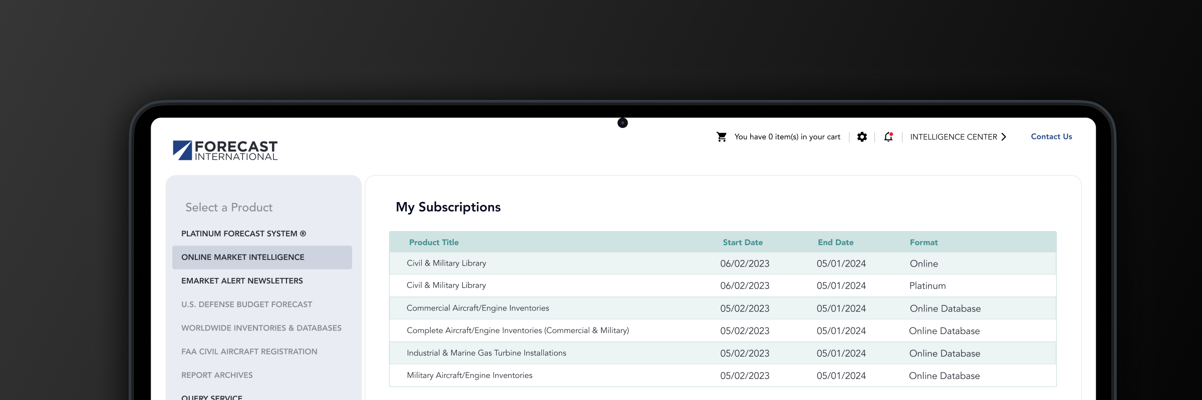
Improving an enterprise market forecasting product
Redesigning Forecast International's data forecasting software-as-a-service app and rethinking how they used their website to drive new leads
- Project Completed 2023
- Project Role UX/UI Design, Branding, User Research, Project Management, Information Architecture
Background
Forecast International had recently been acquired and was in the process of integrating and merging teams and technologies. As part of the integration process, our product team was tasked with helping onboard and potentially make small improvements for accessibility.
I operated as the lead user experience designer, helping shape branding and experience within the app.
Additionally, our team included a product manager and two product developers, whom worked on these products for several years. As a team we worked in two week sprints to complete the different components and features but held rollouts to the project schedule so we minimized interruption to the live product.
At the time of acquisition, we ran user satisfaction surveys with the product user base. After analyzing the results we discovered two key areas where the products could improve. Paid users enjoyed the product but felt the app fell short of its data promises, highlighting an opportunity to refresh the marketing site to drive more sales leads.
Problem Statement
The existing products face declining user engagement from reduced product quality perception and the homepage and related website aren't converting users into potential new product registrations.
Strategy
We broke the project into three deliverables. We did this for a a few reasons but mainly to keep scope creep from slowing down feature updates. The major downside to this approach ended up being spending a lot more time needing to be in QA near the end of the project. We gave QA all the time they needed but I think in the future accounting for that would help communicating the ultimate date of delivery more accurately. QA would probably appreciate more time to staff what they needed as well.
Across the three deliverables we used an agile method for project planning and communication of updates. I will note two items that caused the most adaption were: our total work load priority and our client team's availability were limited. There were very long periods of time between some requests we needed from the client team. Since our team was working on a few different items, we would just adjust which product to focus on for each sprint period but it did increase the project timeline and context switching lag.
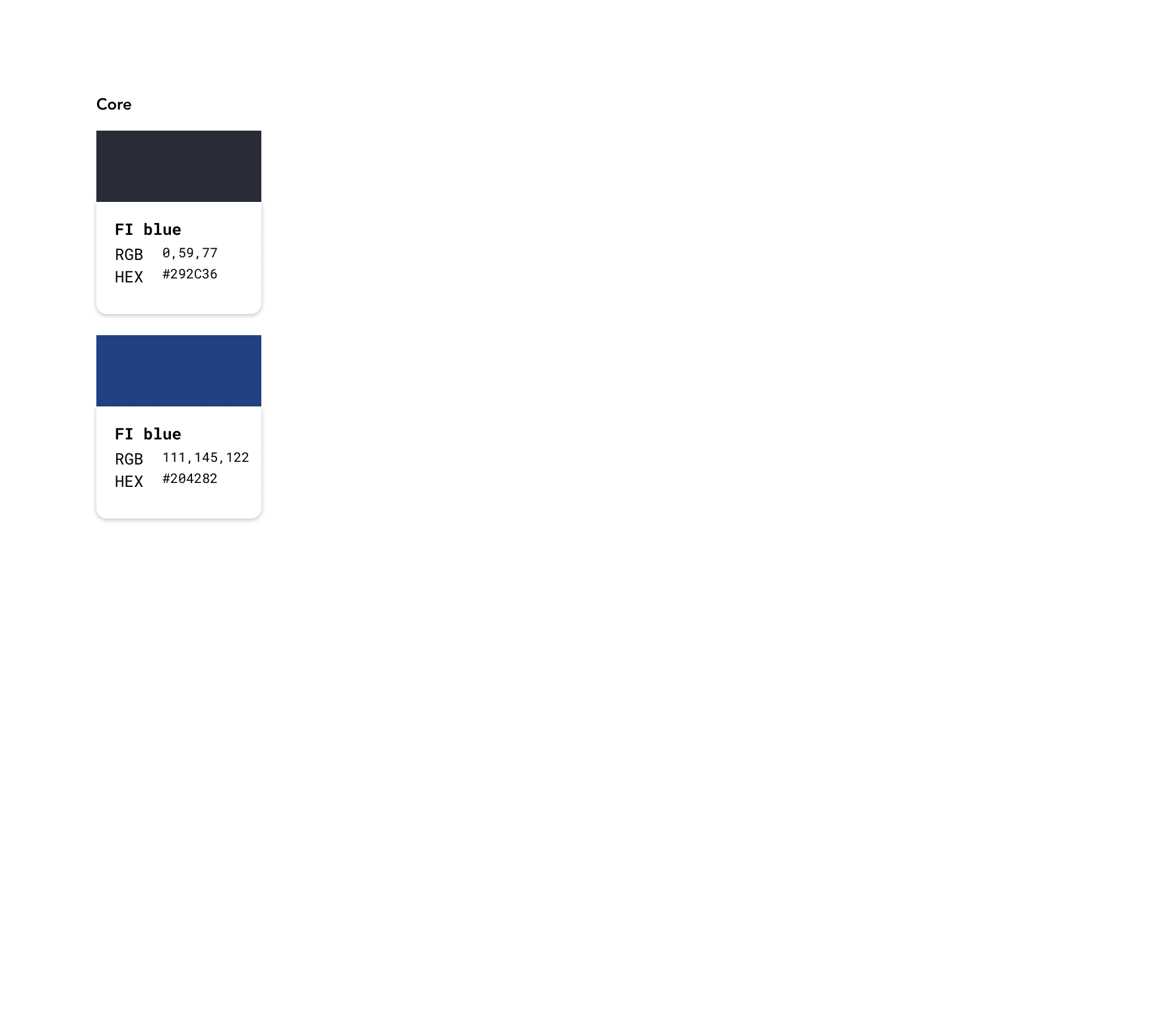
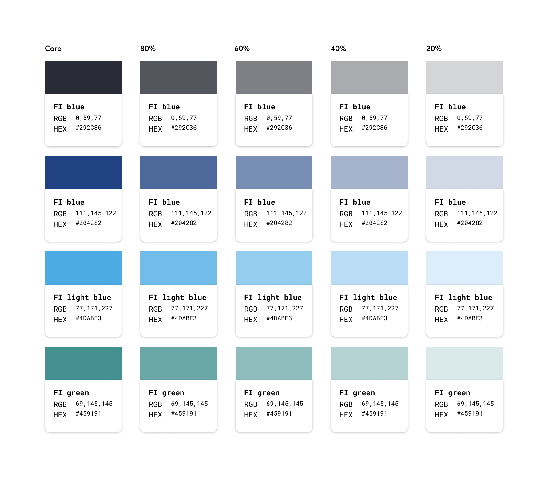
Handoff was also given extra attention as well. The backend codebases were very limiting in what could be changed. We still managed to make effective use of updated colors and accessibility practices.
Challenges
Limited resources and stakeholder priorities caused this project to stall at times. From a design side this created what I would describe as project fatigue. A few times stakeholders would change because the person in that role changed.
Design and development were limited due to different backend code bases and limited development resources.
The backend code had several design limitations that would impact the final result. To work around this, communication between the developers and myself was essential to getting compromise on what could be done.
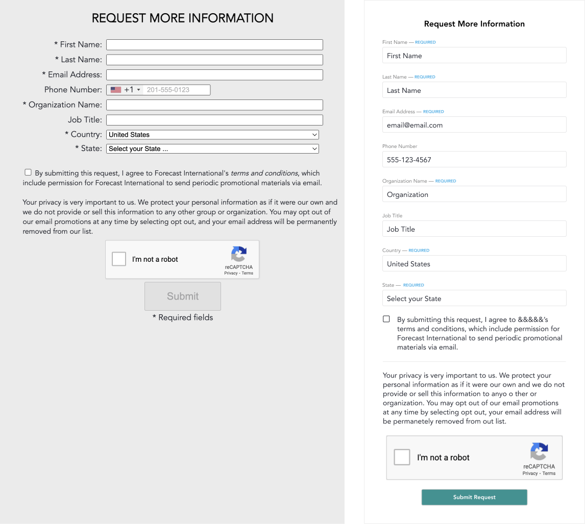
Forms before and after
Execution
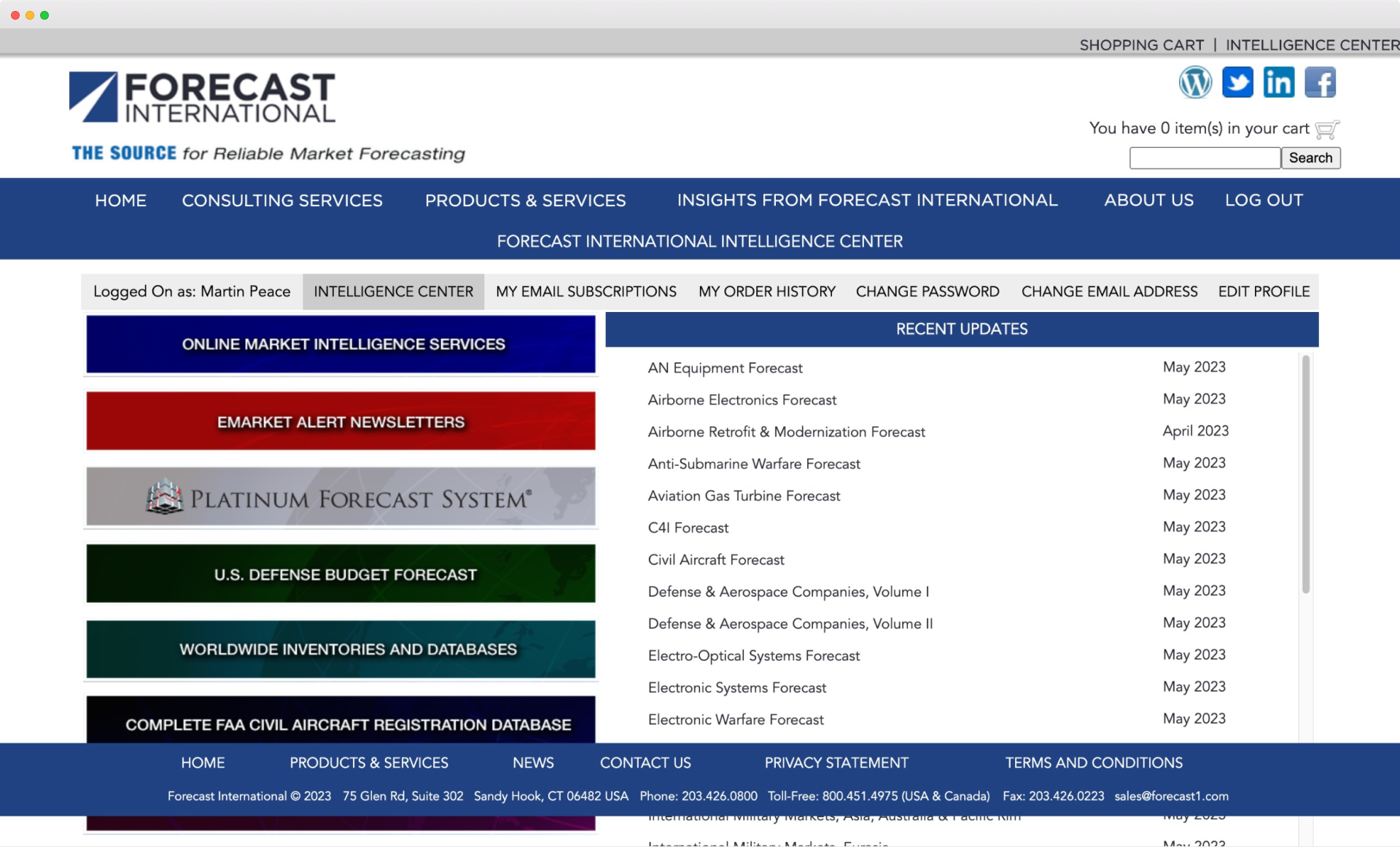
This effectively became an update the brand to account for the more contemporary interface and reduce the user funnel on the marketing landing page. We analyzed and streamlined user flows to make processes more efficient. For example, we cut a lead capture process from five steps down to just two. Throughout every phase of the project, we focused on improving the customer funnel and updating user flows. We also redesigned components to match the new brand experience and prioritized accessibility every step of the way.
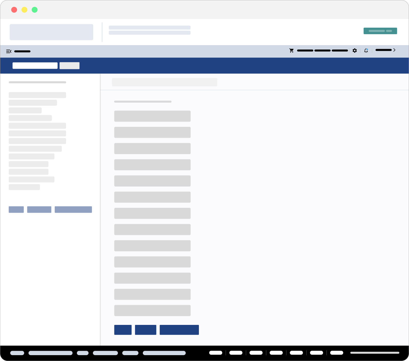
Skeleton design of the platform
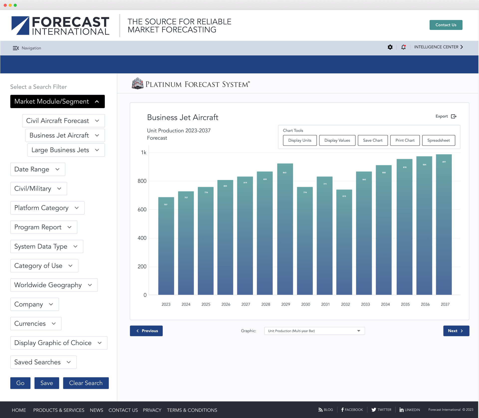
A chart page after redesign.
Results
I'll start with the major take aways on this project, specifically
- After rerunning our user engagement surveys, engagement has shown six months of continued improvement from the accessibility and branding improvements.
- The homepage and website redesign show initial improvement in lead registrations increasing 30%. Conversions still need improvement as we were still not converting all of that 30% increase.
- The project was also validated when the largest client subscriber granted access to the platform for their internal employee use.
This was a very engaging project even though much of that actual work was spent in communication and hashing out the capabilities of these older legacy systems design constraints.
From a business side, reviewing this project I would say, it was successful. We saw improved engagement, updated the brand for future improves to the product and better accessibility.
From a design side, I think all of this could be pushed further if the business had the appetite for that risk. I think however given the user base being very established and fixed, this was the best approach. If, in the future, they want to break out some of the products or implement a new feature they'll have those components setup and ready to get building.
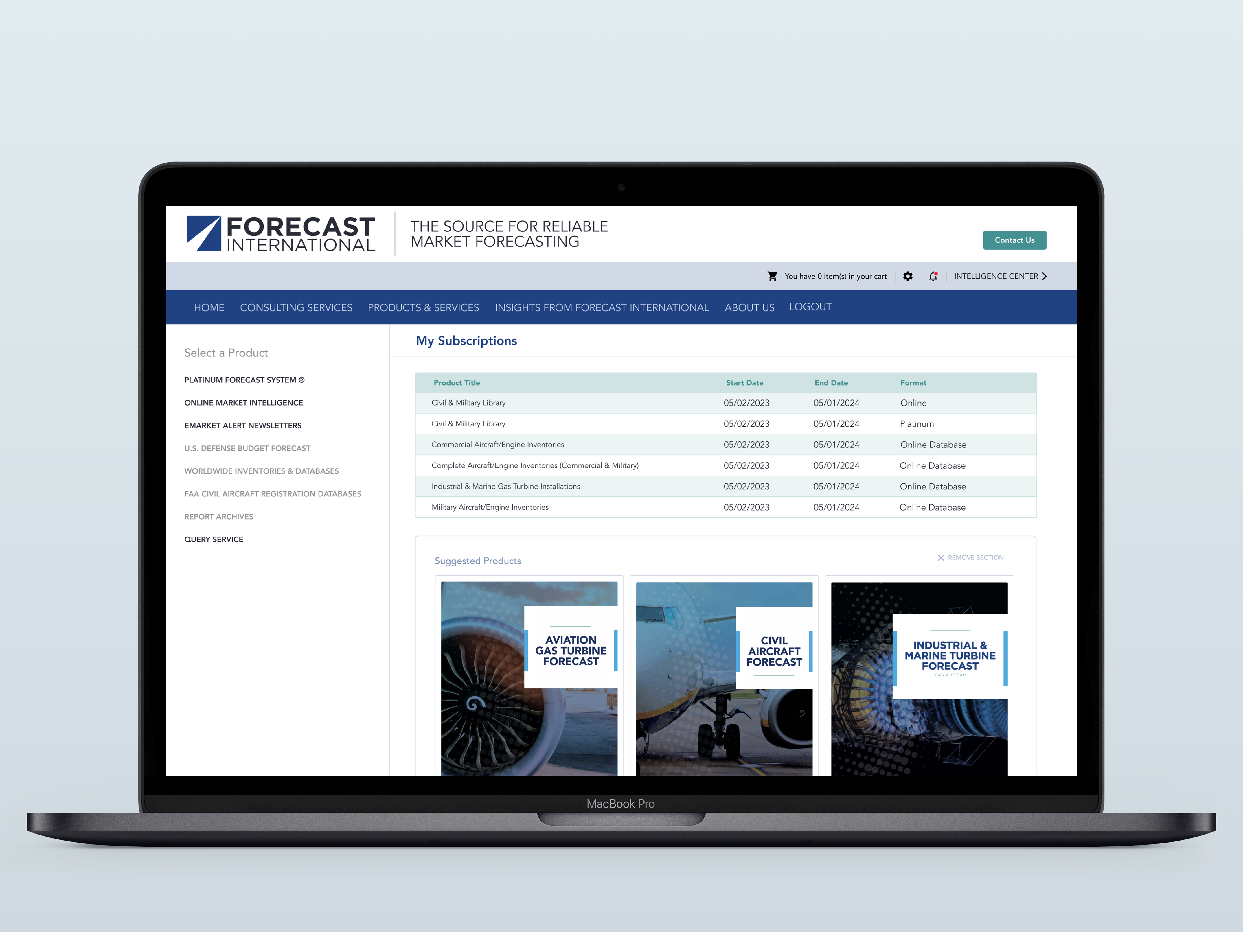
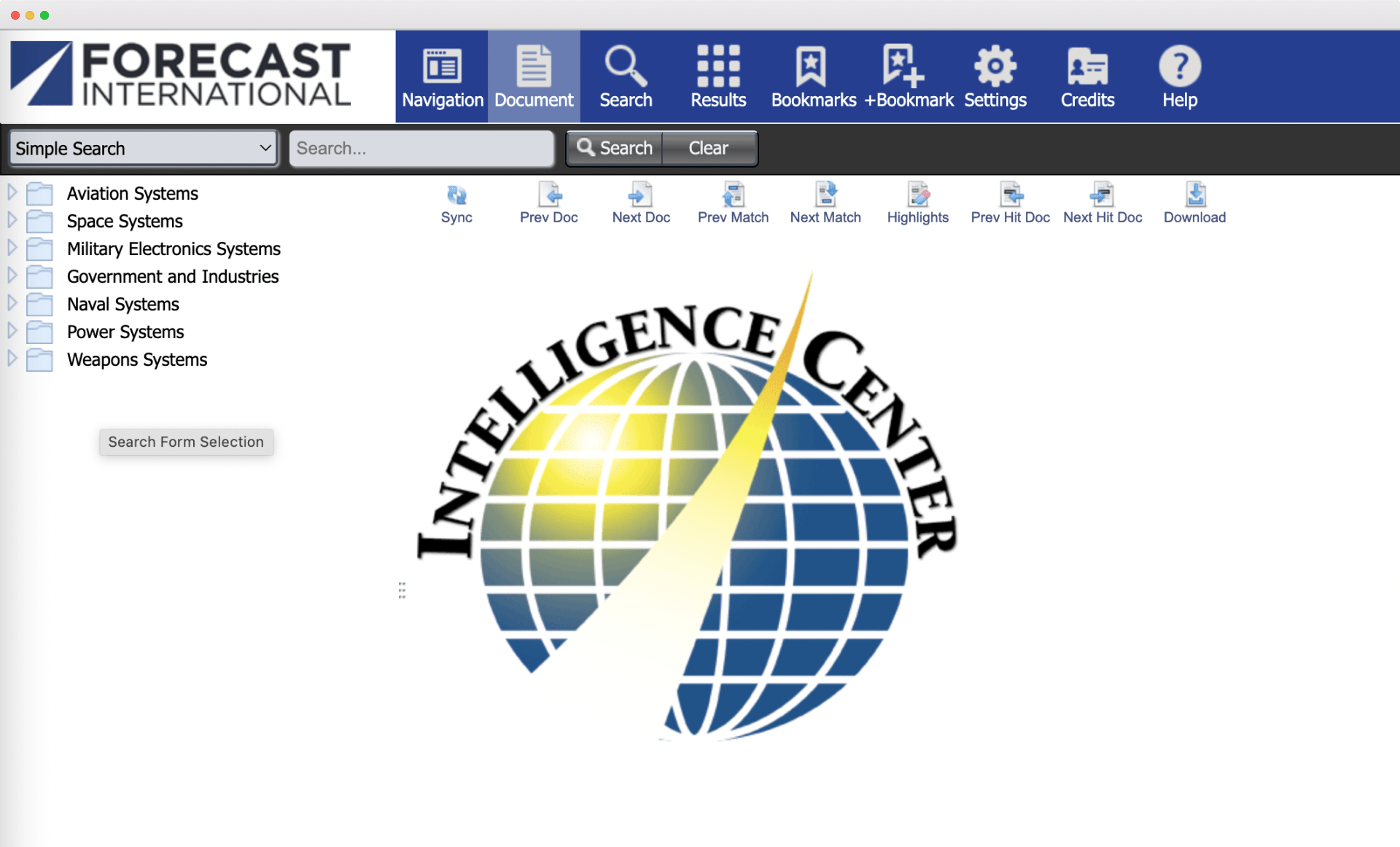
Final designs for the platform
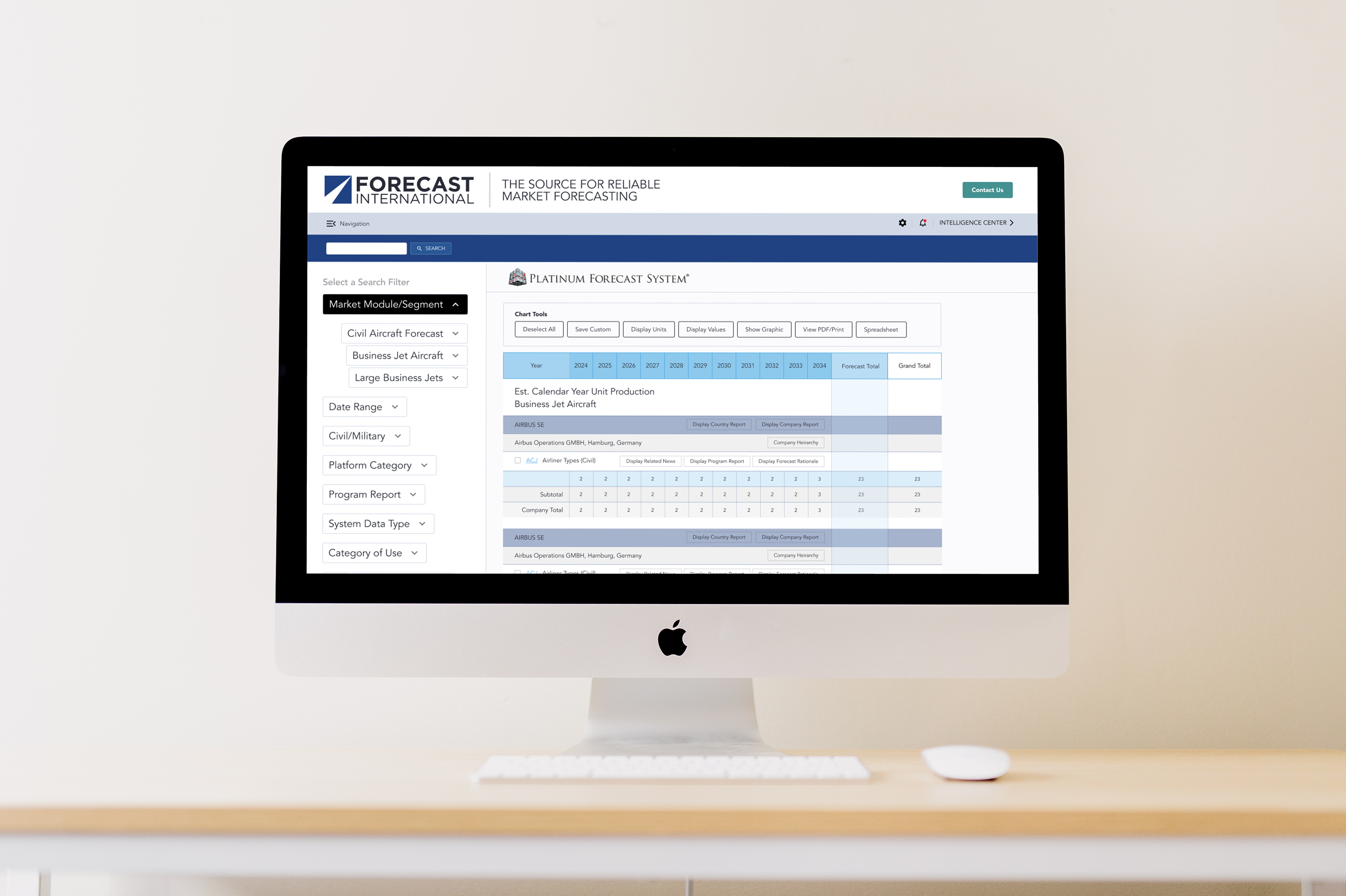
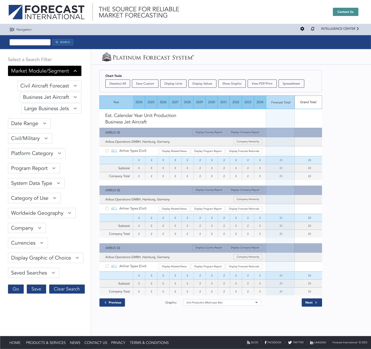
Final product design

